
. . . and here is the text that accompanies it:
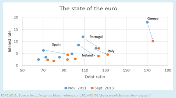
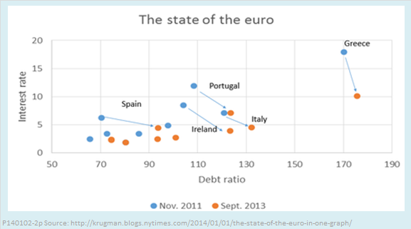
What you see here is that borrowing costs for the troubled euro countries have dropped a lot. But it’s not because austerity policies have brought their debt under control — debt ratios are still rising, in large part because of shrinking economies and deflation. Instead, there has been a dramatic flattening of the relationship between debt and interest rates.
Oops. I see two problems here.
- If “shrinking economies” are distorting fiscal policy indicators that are stated in relation to current GDP (and they are), shouldn’t his graph measure the debt ratio relative to potential GDP, not current GDP?
- Since when is the debt ratio the proper measure of austerity policy? Austerity, which we used to call fiscal consolidation, means reduction of the deficit, not the debt. The debt ratio is too strongly influenced not only by the state of the economy, but by past fiscal history, to be a good measure of year-to-year changes in the policy stance. The chart is further muddled because debt dynamics are strongly influence by interest rates, the variable on the vertical axis.
Let me suggest an alternative graph that better illustrates the relationship between changes in fiscal policy and changes in interest rates. This version has the 10-year government bond rate on the vertical axis (I think that is what Krugman uses, although he doesn’t say so) and the underlying primary balance (UPB) on the horizontal axis. The latter is an indicator favored by the OECD that is similar to what we more commonly call the primary structural balance (PSB). Like the PSB, it is the surplus or deficit of the government budget, adjusted for both interest payments on the debt and the state of the business cycle. The UPB differs from the PSB in that it also corrects for one-off budget measures like tax amnesties and privatizations, factors that are important for some of the European crisis countries.
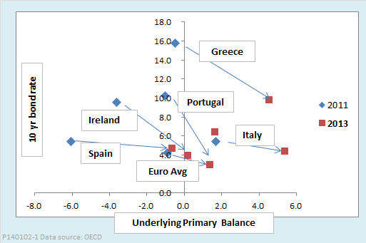
My alternative version of the chart bears a superficial resemblance to Krugman’s original, in that the arrows all point down and to the right. In fact, though, the message it suggests is exactly the opposite of the concusion Krugman wants us to reach. Krugman invites us to interpret his graph as showing that austerity is not the cause of falling interest rates, whereas the alternative version suggests that austerity is helping to bring interest rates down.
Who is right? Well, we all know that correlation is not causation, so neither graph really proves anything. The most we can say about any such graph is whether it is consistent or inconsistent with some hypothesis about the economy. Anyone who understands the basic economics of fiscal policy can recognize that a tendency for the current debt ratio to rise while interest rates are decreasing is not inconsistent with the hypothesis that austerity is the cause of the decrease in rates. A tendency for interest rates to fall as the underlying balance moves toward surplus is consistent with the hypothesis that austerity is at least among the factors bring rates down.
As regular readers of this blog will know, I am no big fan of fiscal austerity during a slump. Such policies are procyclical. The time to fix the fiscal roof is when the cyclical sun is shining. Premature fiscal consolidation has very likely slowed recoveries from the global crisis in both Europe and the United States. Also, I would not dispute that the “Draghi effect,” as Krugman calls it, is a contributing factor in bringing euro interest rates down. The European Central Bank Chairman’s pledge to use all available tools of monetary policy to save the euro undoubtedly has had some effect on rates. Still, it does seem plausible that, when deciding how much to pay for euro bonds, investors have taken into account the huge swings toward surplus in the underlying balances of the crisis countries.
Paul Krugman, I think, knows all this. Although it is only January 2, may I nominate his graph for the most disingenuous of the year?